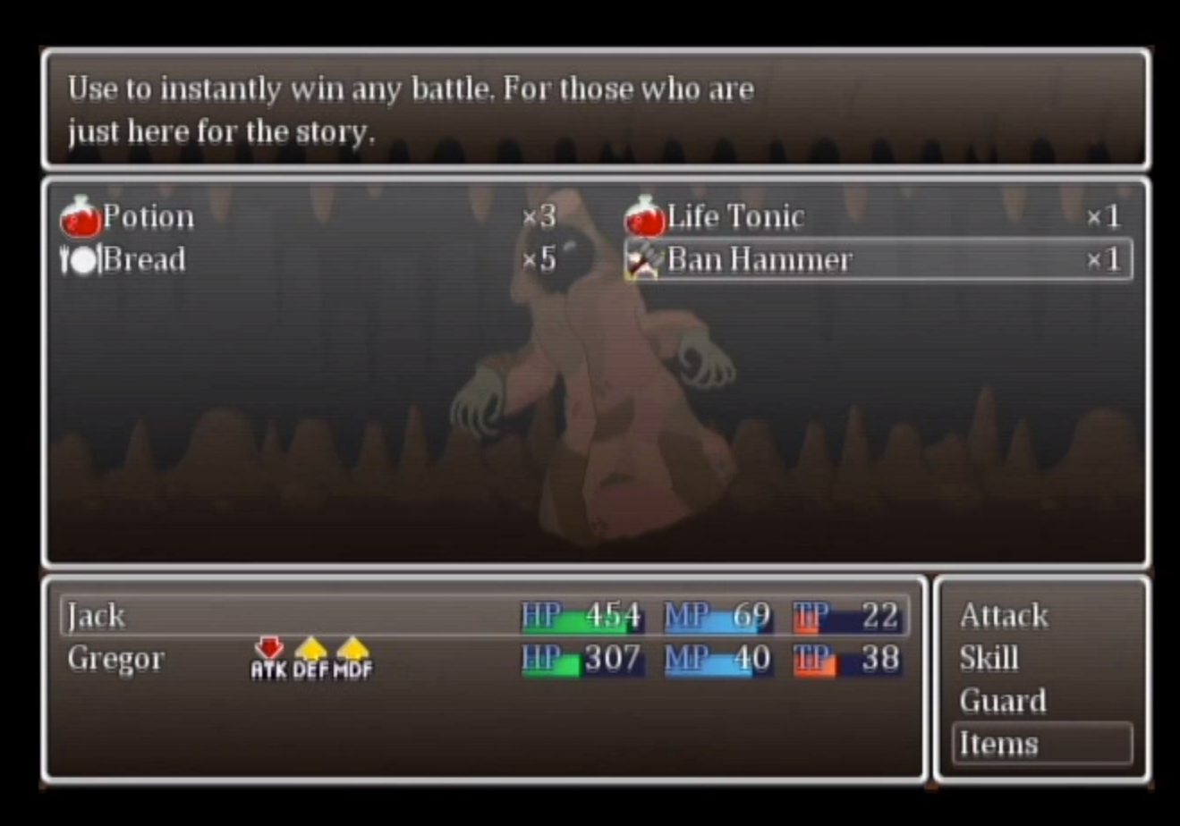
As a design challenge, I remade the user interface of a fake dress-up smartphone game (original prompt pictured in the lower right).
The interface elements outside of the screen indicate alternate states of the corresponding elements within it. For example, tapping the hamburger icon below the shop name opens up the full list of items available in this shop. The price indicator in the center of the screen changes based on what currency is used to purchase the currently viewed item and if the player can afford to do so.
Back to Top
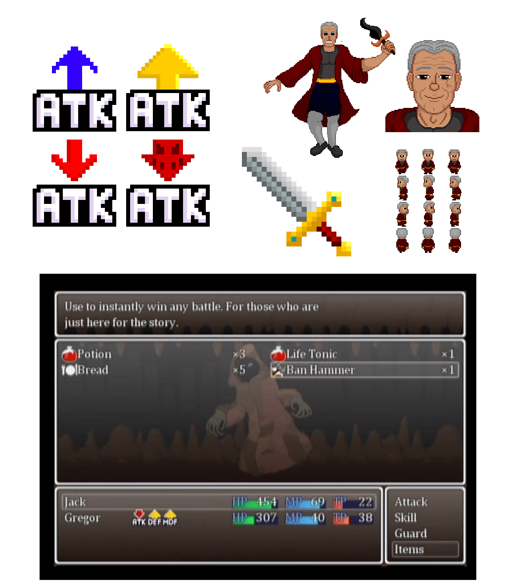
In 2017, I worked as an art co-op for Dark Cellar Studios, providing 2D assets for the game Gilded.
Working for Dark Cellar, I created animated sprites, character portraits, enemy portraits, and user interface icons to denote the types of different items and effects.
Gilded is currently available on Steam.
Back to Top
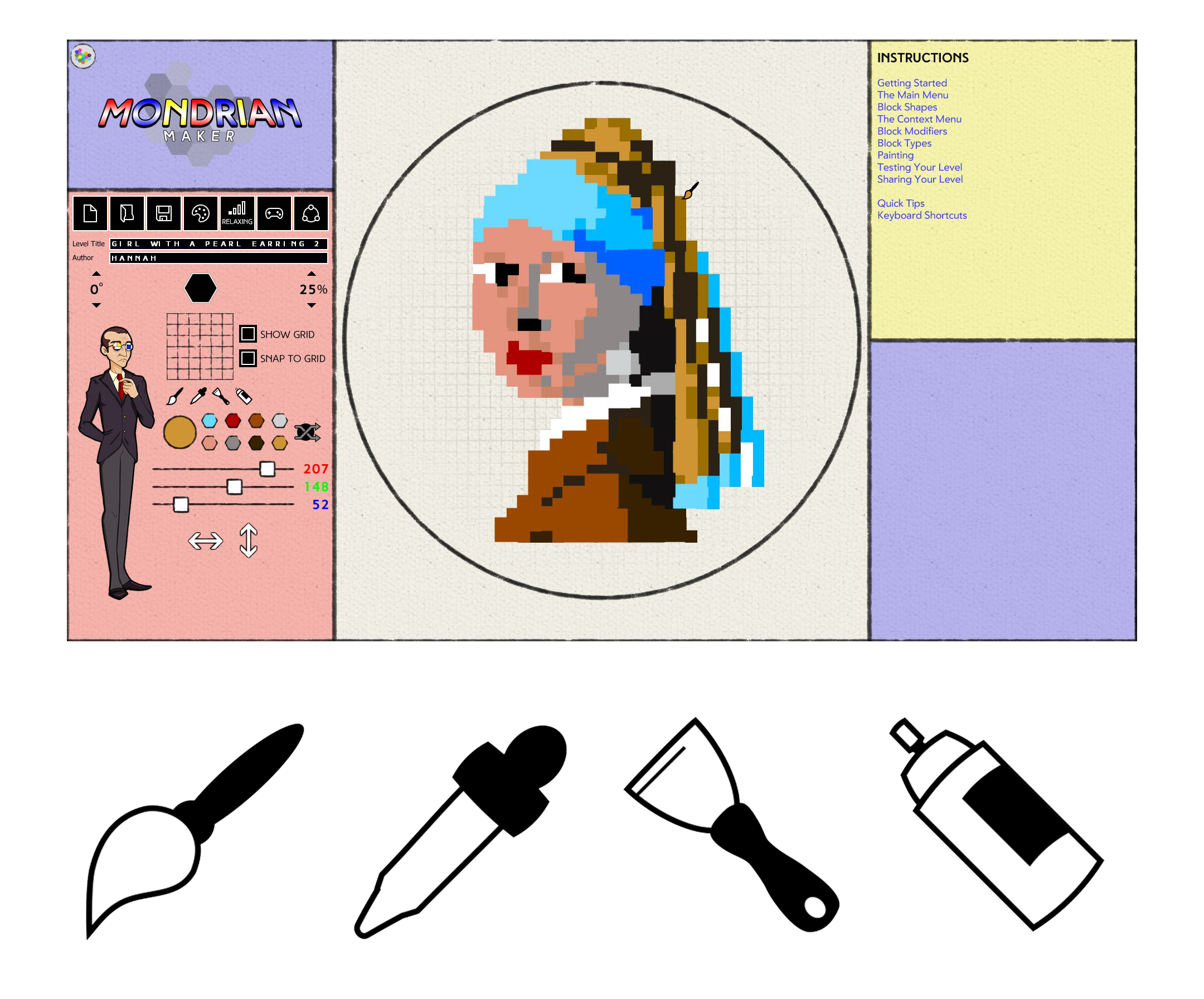
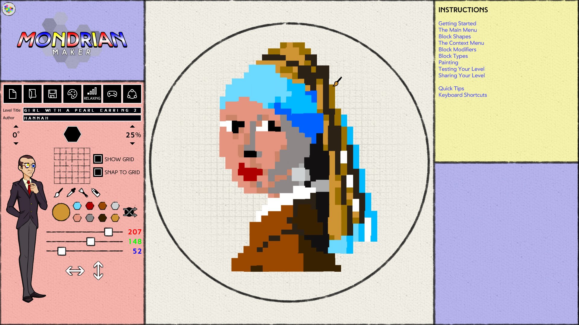
In 2018, I worked as an art co-op for Lantana Games, providing 2D art assets for their games Children of Liberty and Mondrian: Plastic Reality.
As part of the art team I researched and created textures, decorative assets, and interface icons. With Mondrian, this included the level editor tools pictured below the main image.
Back to Top
At Northeastern University, I joined a team of other students in creating Pigeon Coup, a narrative-focused puzzle game about managing messenger pigeons in a fantasy land. While my primary role was head writer, I contributed in a number of ways including gameplay design, logo design, website co-design, and creating the trailer.
Pigeon Coup was featured at the 2019 Boston Festival of Indie Games.
Back to Top
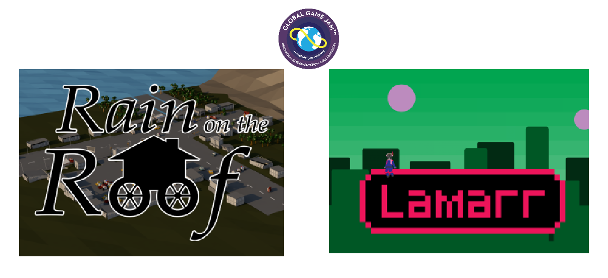
As part of the Northeastern University Game Development Club, I assisted with site organization for the Global Game Jam from 2017-2019 as well as participating in it.
As a participant, the two games I am most proud of are Lamarr, a side-scrolling platformer about using a radio to navigate an alien world, and Rain on the Roof, a 3D "Bullet Hell" game about rescuing a collection of characters as an living house. For both of these games my primary role was 2D artist, but I also took on the tasks of level design, logo design, project management, and trailer production.
Back to Top
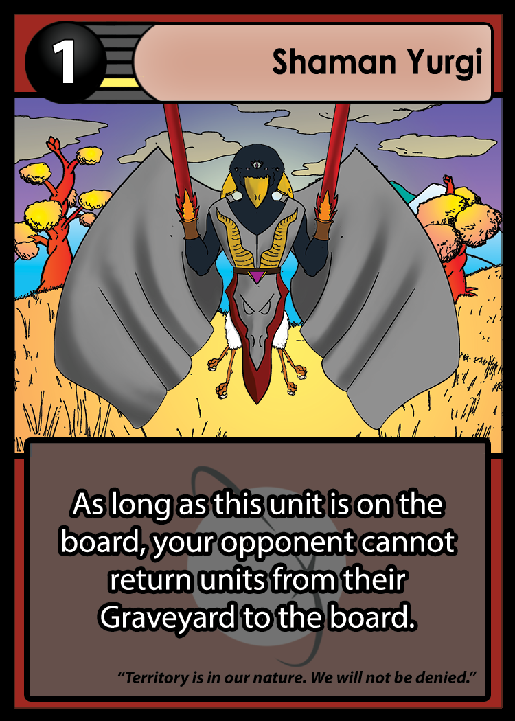
Moving to Planet X was a card game created as a team project with several other Northeastern students. Inspired by one-on-one card games such as Gwent, the players accumulate points by placing cards on the six rows of the board. While I did provide story and background art, my biggest contribution was in the card layout.
In the top left corner of the card is its points value, given a position of prominence since points are crucial to winning the game.
To the right is the position indicator, which tells the player where on the board they can place that card. In this case, they can only place the "Shaman Yurgi" card on the row second closest to themselves.
The card name field takes up the rest of the uppermost row.
Below that is the card art, and under that is the text box. The rules text is prominently displayed in white text with a black outline, while additional flavor text is written in black text and kept to the bottom of the box. In the background of the text box is a translucent version of the game's logo.
The rest of the card frame is color-coded to the character's in-story faction. In this case the card is red to represent the Yurgi, a race of bird-like aliens. I did at one point raise a concern that a texture pattern would be more inclusive to color-blind players, but since the factions have no effect on gameplay we opted to keep the single color for the cleaner aesthetic.
Back to Top
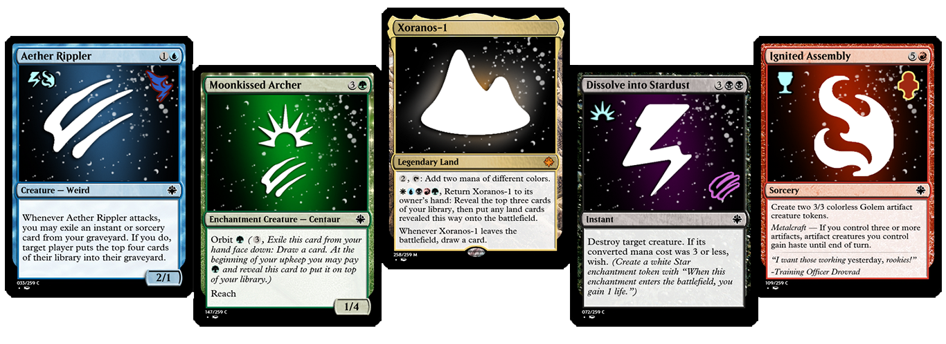
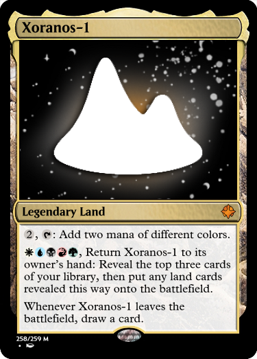
As a personal project, I designed a custom set of over 200 Magic: the Gathering cards to create an expansion much like those made by Wizards of the Coast. In doing so, I sought to create interesting new cards while remaining true to the ideas and design principles of the game.
The set, Xoranos, is designed to evoke the feeling of outer space science fiction such as Star Trek.
The mechanical theme of the set focuses on card types, and has three mechanics seen above: Wish, Orbit, and Metalcraft.
The set is designed so the games play out relatively slowly, giving people time to think and plan, as is appropriate for the slower pace of the science fiction source material.
Back to Top
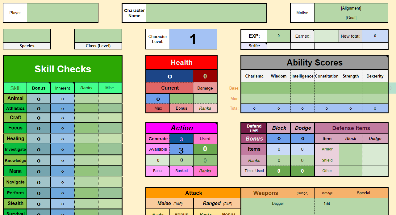
Another personal project, Life in the Bigger Sky is a tabletop roleplaying game of my own design.
While playing Pathfinder, I noticed how a well-made spreadsheet could automatically complete the various equations that are a staple of the game's design. Life in the Bigger Sky explores the benefits of this concept, making use of more complex equations than I would ever ask players to solve in a pen-and-paper system. Many fans of TTRPGs prefer the convenience of digital character sheets, and LitBS is designed for them.
There were a handful of unique challenges using Google Sheets as a platform. The primary proplem was making sure the players understood which specific elements they could interact with without accidentally deleting important elements. I settled on a combination of specific fonts and colors, with explanatory text provided as a frozen row of the sheet. It is possible I could have gotten better results with a different tool, but I wanted to stick with Google Sheets for how easy it is to share with others across platforms.


